Table of Contents
Dashboard
| The dashboard is a collection of reports and charts, you can customize it to show any number of charts to any number of period and users only limited by the accessability of the user |
|---|
Default dashboard charts
There are few predefined charts, with the measured datas, such as worktypes, worktimes, application and url usage etc… . In this section you can learn about this default dashboard charts.
The charts about the current user or group, depends on the accessability level (user level see it's own data, supervisor/administrator see it's own group's data)
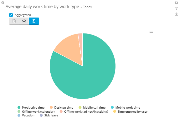
Average daily work time by work type - Today
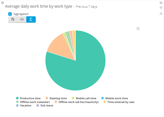
Average daily work time by work type - Previous 7 days
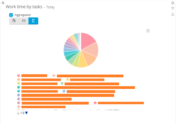
Work time by tasks - Today
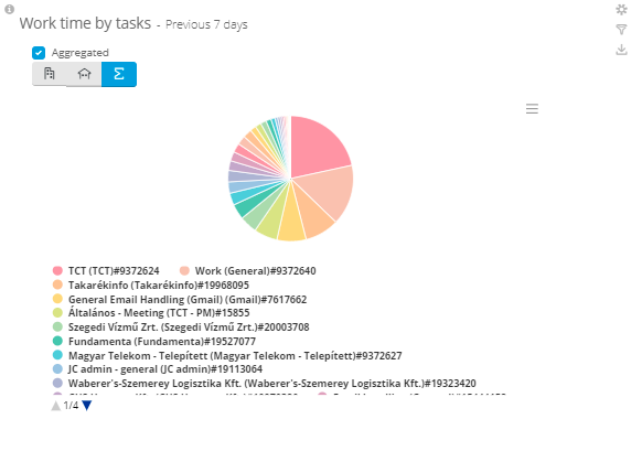
Work time by tasks - Previous 7 days
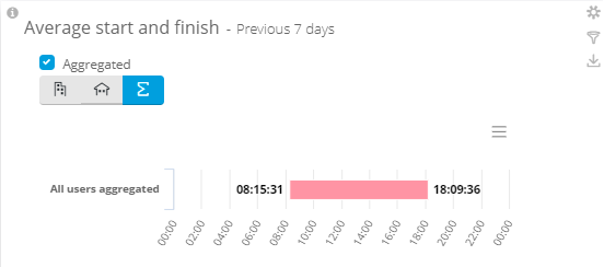
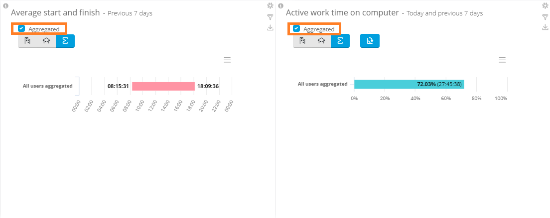
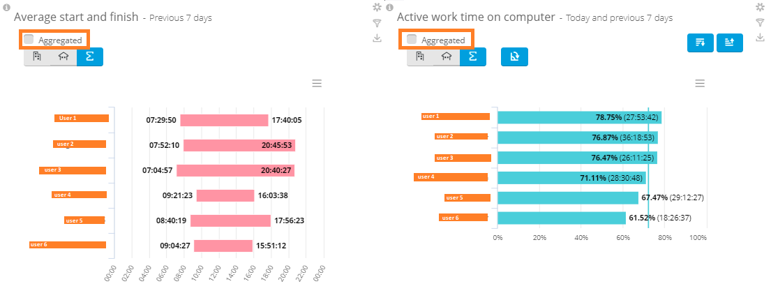
Average start and finish - Previous 7 days
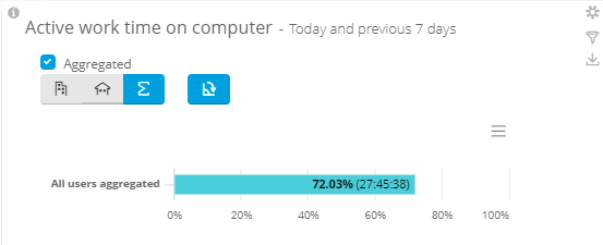
Active work time on computer - Today and previous 7 days
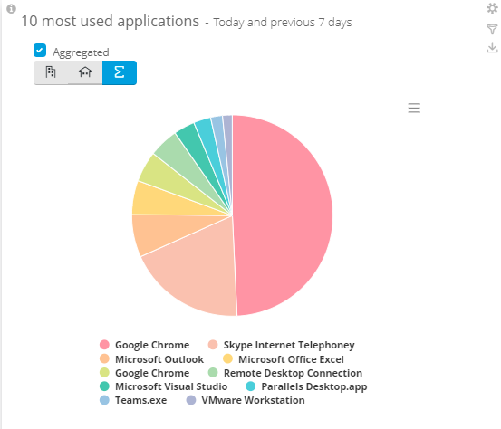
10 most used applications
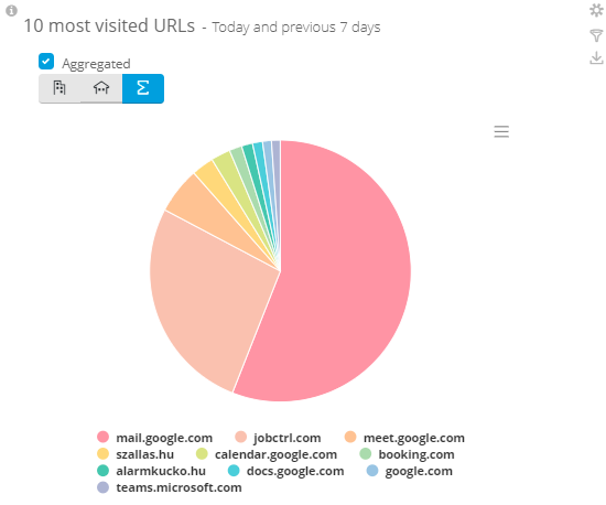
10 most visited URLs
Aggregated and Non-aggregated data
If you are on a supervisor/administrator level, you see your group(s)'s data in a whole (average values), but you have the option to see the group aggregated or separated with the “aggregated” checkbox:
Options to customize your own Dashboard
Every user's dashboard is unique, if any user modify it's own dashboard, the others remain the same.
You can customize the existing charts:
- changing the users/groups the chart is about
- changing the period
- giving a refresh rate to see the data near real time
- you can rearrange and resize the existing charts
If you select the ![]() icon on the right side of the chart, you can give these informations.
If you want to play around, just select “apply” and if you pleased with the result, you can save these options by clicking on “save”.
icon on the right side of the chart, you can give these informations.
If you want to play around, just select “apply” and if you pleased with the result, you can save these options by clicking on “save”.
You can create your own charts or report views: If you have a report with html view, you can add it to your dashboard by clicking on the + Add new… button at the top right corner. In the menu you will see the default charts on the top and the existing favorite reports with html view.
